Kdenlive 25.12 RC released
The Kdenlive development team has put out a release candidate for Kdenlive 25.12, which is another step in their ongoing effort to refine this popular video editing platform. With the latest update, users can expect a smoother and more intuitive experience courtesy of some thoughtful tweaks to the user interface.
This new RC focuses a lot on refining how you actually use the program day-to-day. They've made some tweaks, mostly behind the scenes but importantly visible through the user interface (UI). The goal wasn't just to change things randomly; it was specifically to make the editing process smoother and feel more natural, less clumsy.
First off, getting started in Kdenlive has always been straightforward thanks to a solid UI. Now they've taken that UI and given it an overhaul designed to streamline your actual workflow while you're editing. Think of it like decluttering your digital workspace; panels can now be moved around much more easily than before. There's no longer this annoying feeling of being stuck with one rigid way the program looks – you genuinely have freedom here to rearrange things.
That flexibility extends to the clip monitor too, which is basically your main viewing panel for everything video-related in Kdenlive. It’s been completely refreshed internally, now showing an audio waveform overview by default. Why does this matter? Because it makes finding specific parts of your soundtracks way faster and easier, you don't have to guess as much; the visual helps.
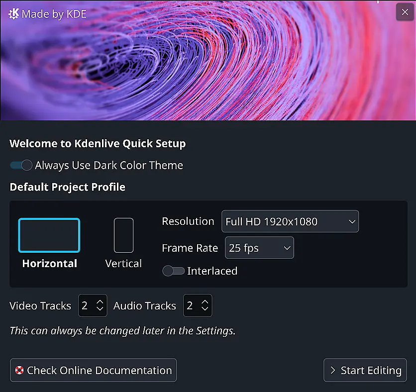
There's also a new welcome screen popping up when you first launch Kdenlive after this update. This isn't just some window; it offers a quick way to get into action if you know what you want by providing shortcuts for starting projects with common preferences or importing settings directly on boot-up. Less clicking around, more diving in..
Beyond these general UI improvements and welcome features, specific upgrades have landed too. One thing everyone editing might appreciate is support for vertical formats (like those popular social media videos). Kdenlive now includes dedicated editing layouts plus safety guides specifically designed for portrait-oriented projects. That means creators dealing with non-standard aspect ratios can work comfortably without straining to see the edges or worrying about exporting mess-ups.
The menu structure itself has undergone a lookover, aiming to present tools and options in a more logical order than previous iterations. This is subtle but could genuinely save time, searching for something shouldn't feel like digging through a haystack anymore if it's properly organized.
Video editing wouldn't be complete without talking about markers (those little notes placed at specific times). Kdenlive always had these, allowing you to jump quickly back to important moments in your timeline. The latest update adds a new kind of marker: one that lets you define an entire time period as marked, which is pretty useful for highlighting scenes or sections directly. This feature was actually developed during last year's Google Summer of Code event too.
So, it’s not just about looks; there are practical improvements here designed to make the editing process itself feel lighter and more efficient, especially when dealing with complex timelines or specific formats you rely on.
Kdenlive 25.12 RC Ready For Testing
The Kdenlive 25.12 Release Candidate is ready for testing. We made several changes to the user interface to improve your workflow, including a new widget docking system that makes rearranging panels much easier and more powerful, an enhanced audio display in the clip monitor with a waveform overview for faster navigation and zooming, and a new Startup and Welcome screen allowing to easily select a few options when launching the program.